
Marginal abatement cost curves
A marginal abatement cost curve, or MACC for short, provides a government or institution a graphically prioritized list of greenhouse gas (GHG) reduction measures. Here is a MACC that I developed for the three combined campuses of the University of Washington in Seattle, Bothell and Tacoma, Washington:

This MACC compares the GHG emissions reductions and costs for 36 different measures that UW was considering. The width of each bar is proportional to the annual GHG reduction the measure achieves in the chosen target year – in this case, calendar year 2035. The GHG reduction is expressed in units of metric tons of carbon dioxide equivalent (tCO2e). The wider the bar, the greater the GHG reduction achieved in the target year.
The height of each bar is proportional to the cost per unit of GHG reduced. In UW’s MACC, those values are expressed in units of $/tCO2e. These values are calculated in a somewhat more complex way than the target-year GHG reduction. The costs are discounted and summed over a specified period of time, usually from the present to the end of the measure life. The measure life might be very short, say 5 years, for administrative actions like a purchasing policy; or can be very long, say 60 years, for investments in permanent infrastructure like a district heating system. The greenhouse gas reductions are summed over the same period of time. So the ratio (the marginal abatement cost) is the present value of all the GHG reductions during the measure life.
Some bars have negative heights (falling below the horizontal axis), meaning that the GHG reduction actually saves money. Most governments or institutions will discover several of these: they are usually energy efficiency measures that save money by reducing fuel or electricity purchases. I am always asked, Why haven’t these been done yet, if they save money? The three most common reasons are: because the payback time is too long, because the savings accrue to a different budgetary account than the initial investment, or because the recipient of the energy savings is not the same party who has to make the initial investment.
Interaction
The first step in creating a MACC is to brainstorm GHG reduction measures. That’s a “soft” process and the chosen set of GHG reduction measures will vary widely in nature and scale. Usually, quite a few of the measures interact with each other, meaning that their respective GHG reductions (the widths of the bars) can’t be simply added to each other, but need to be corrected first. There are three basic kinds of interaction:
- Enablers: Measure A enables Measure B. For example Measure A might be all energy efficiency improvements identified by a building retrocommissioning program, and Measure B might be energy efficiency achieved through thermostat retrofits. In this case, all reductions due to Measure A that accrue to Measure B must be subtracted from Measure A.
- Overlap: A portion of Measure A is identical to a portion of Measure B. For example, Measure A might be an across-the-board loosening of building temperature policy, while Measure B is a deeper, night setback only. In this case, the reductions associated with the overlapping portion must be distributed between Measure A and Measure B with any method the analyst chooses. In the example, the portion of the night-setback that is equal to the loosened thermostat range needs to be distributed between the two measures.
- Shared domain: Measure A and B are technologically non-overlapping, but act on the same source of GHG emissions. For example, Measure A might improve the fuel-efficiency of a vehicle fleet, and Measure B replaces the fleet’s diesel fuel with B20 biofuel. In these cases, the interaction can be calculated with a slightly more complicated formula described in detail in the writeup on “Interaction of Emission Reduction Mechanisms” you can find on my tools page.
Once an institution has created a MACC, they often decide to bundle certain selections of measures together, or will decide to skip some measures based on qualitative factors that are not part of the marginal abatement cost analysis. For this reason I rarely attempt the grueling task of calculating all overlaps for the entire set of analyzed measures, but instead calculate overlaps on a case-by-case basis, once the client is done with the basic curve and needs to consider competing approaches to implementation.
Alternative formats
There are other ways to display the results of marginal abatement cost analysis. Here is one that Stockholm Environment Institute conceived together with King County a few years ago, and that I then implemented for their 2015 Strategic Climate Action Plan:
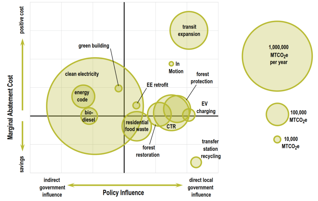
In this graphic, the GHG reduction is proportional to the bubble area, and bubbles that float higher on the vertical axis have a higher abatement cost. This format provided two advantages to the County: first, it allowed for a third dimension to be plotted on the horizontal axis (policy influence); second, it allowed for nearly three orders of magnitude range in the scale of proposed reduction measures (since the diameter of a bubble increases only as the square root of its area).